BRANDING
The following examples were new or reimagined businesses. All elements were produced in collaboration with the client to develop something unique that represented each business and speak to their target audience.
Details
Produced at various times between 2013 and 2016.
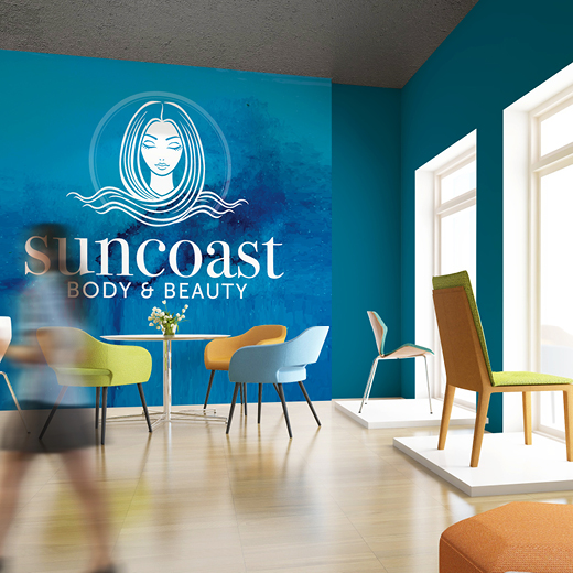
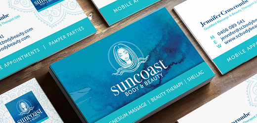
Suncoast Body & Beauty – the client needed to progress their previous brand image to be in line with new services and be something they connected with personally. The brief was to create something that could, over time, also represent new yoga and meditation services and engage a higher quality client. The old branding was scrapped and new logo and brand material produced in collaboration with the client, including stationery, car signage, flyers and website elements.
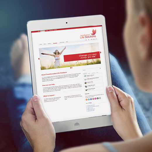
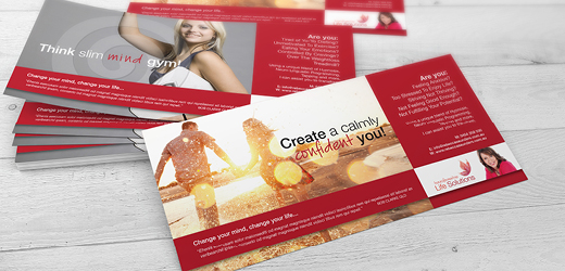
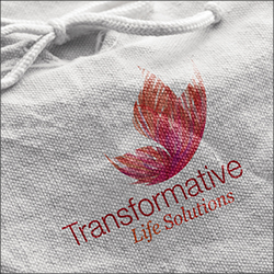
Transformative Life Solutions – the client needed to progress their previous brand image to reflect new services and be something they connected to personally. The brief was to use red and the client had significant input in the overall outcome. A new logo was completed, along with stationery, flyer, social media graphics and a website visual. I believe the branding has been redeveloped again since completing this in approximately 2013.
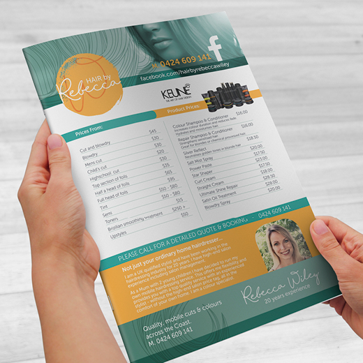
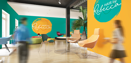
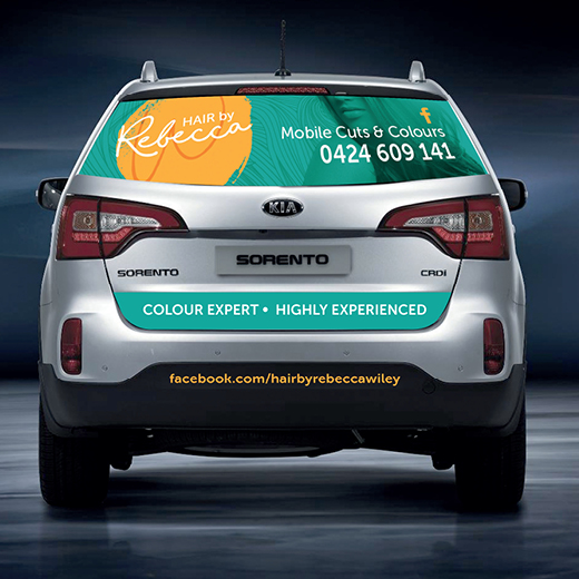
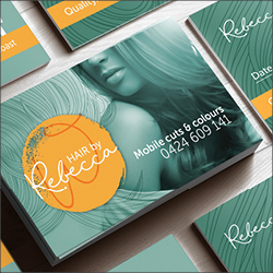
Hair By Rebecca – this was a brand new business and the client had no real ideas about how they wanted the branding to eventuate, so I asked detailed questions about the client and their services to really get to know them. The businesses for mobile hairdressing with a highly professional service. I produced several concepts to start with until the client connected with a particular direction. I have since developed the logo, stationery, car signage, social media graphics and flyers.
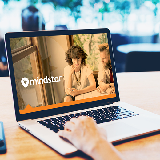
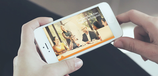
Mindstar – the client had an existing professional brand and required a Powerpoint presentation template for a corporate product launch.
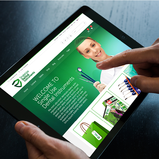
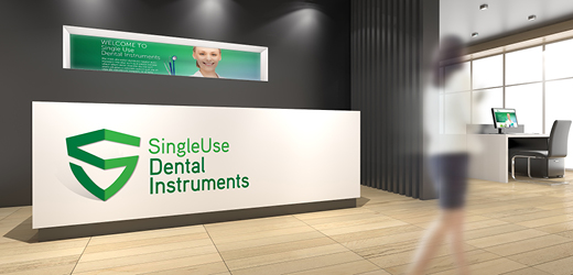
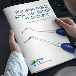
Single Use Dental Instruments – this company had strong ideas about what they didn’t like as soon as they saw it, with multiple people having input through the design process. You may notice that I have included two different logos, and this is because I believe my first ‘shield’ concept answered the initial brief and is the more successful solution. However, after multiple concepts and mockups, the cube concept was adopted and run out across stationery, website, social media and digital marketing, brochures and packaging. I worked as the in-house designer here – it’s a totally different working experience compared to agency work.
